I’ve never been a designer. But lately, I’ve found myself putting together more and more presentations, and I wanted them to have a bit more visual presence.
You know that feeling when you’re watching a conference talk video, and the speaker has this beautiful, cohesive slide deck with custom backgrounds that just elevate the whole presentation? I wanted that too. But, I have a bad habit of giving original talks every time, so I knew I wasn’t going to be able to work with a designer on every single one.
Generic templates felt limiting. They look ok, but they have that “template” feel to them. Lots of them are the same gradients and stock photos everyone else is using. They don’t help tell my specific story or match my specific topic. And while there are thousands of templates out there, finding one that actually fit your content and aesthetic vision could have taken longer than putting the slides themselves together.
I wanted something that felt custom to me, without having to become a Figma expert overnight.
It turns out that combining ChatGPT with Midjourney creates a surprisingly effective workflow for generating custom slide backgrounds without the need for a design degree.
This isn’t about replacing designers (and I know some who I’d definitely call if I was working on a marquee talk). Instead, it’s about finding the places where AI tools can give me a nice visual boost without taking me out of the flow of building my talk. This process boils down into three main steps:
- Ideation – Use ChatGPT to craft an effective Midjourney prompt based on the “vibe” of my talk and any ideas I might have about the general style
- Generation – Create and iterate on backgrounds in Midjourney
- Refinement – Jump back over to ChatGPT to get typography and color recommendations to round out the whole thing
In about 30-45 minutes (or 15-20 once you’ve done it a few times), I can create presentation backgrounds that look professional, match my content, and give my talks that polished conference aesthetic.
Let me show you how.
Step 1: Start with the right prompt
The first step is getting ChatGPT to help me craft a Midjourney prompt. This might sound like using AI to talk to AI (which, yes, it is), but there’s a good reason for it: ChatGPT knows Midjourney’s prompt language better than I do! Midjourney has its own prompt language with specific parameters and flags (like –ar 16:9 and –v 6), which I don’t have memorized. But ChatGPT is really good at translating my creative vision into that very specific language.
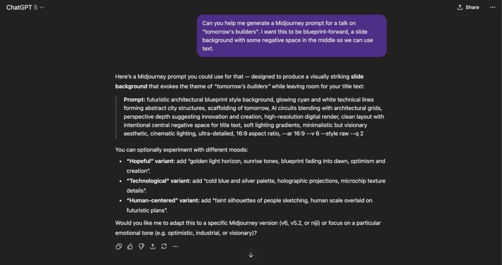
When I was giving a talk to some prospective Retool builders, here’s what I asked for:
“Can you help me generate a Midjourney prompt for a talk on ‘tomorrow’s builders’? I want this to be blueprint-forward, a slide background with some negative space in the middle so we can use text.”
Notice what I included:
- The theme (“tomorrow’s builders”)
- A visual direction (“blueprint-forward”)
- Technical requirements (“negative space in the middle”)
I don’t need to be super specific at this stage. I just give the model enough to work with. It needs to know what my talk is about, any visual ideas bouncing around in my head, and the practical constraint that I need some open space in the center of the image for text. When you’re creating slide backgrounds, this is particularly important.
ChatGPT came back with something like this:
“futuristic architectural blueprint style background, glowing cyan and white technical lines forming abstract city structures, scaffolding of tomorrow, AI circuits blending with architectural grids, perspective depth suggesting innovation and creation, high-resolution digital render, clean layout with intentional central negative space for title text, soft lighting gradients, minimalistic but visionary aesthetic, cinematic lighting, ultra-detailed, 16:9 aspect ratio, –ar 16:9 –v 6 –style raw –q 2”
That’s a solid starting point. Notice how ChatGPT added all those flags at the end—things like --ar 16:9 (which sets the aspect ratio to widescreen for presentations) and --v 6 (which tells Midjourney which version of its model to use). I don’t need to know what all of these do; ChatGPT handles that part for me.
However, as with most AI tools, it’s rarely perfect on the first try.
I usually go back and forth a couple times. Maybe the first prompt feels too busy, or the colors weren’t quite what I had in mind. Sometimes ChatGPT will even suggest different emotional directions: a “hopeful” variant with sunrise tones, a “technological” variant with cooler blues, a “human-centered” variant with silhouettes. Feel free to go down each of these paths and see the prompts that come out.
It can be hard to know exactly how each of these prompts will turn out when you’re just looking at them as text, so feel free to grab a couple that you think are promising to test out in Midjourney.
A few things I’ve learned about this back-and-forth:
- Be specific about what’s not working. “More whitespace” is better than “I don’t like it.” “Lighter colors” is better than “this feels off.”
- Don’t worry about understanding every Midjourney parameter. ChatGPT handles the technical stuff (–ar for aspect ratio, –v for version, –style, –q for quality). I just focus on the overall creative direction.
- Save the prompts. Once I land on something good, I copy it. I might want to generate more backgrounds in the same style later.
After a few rounds, I’ll have a Midjourney prompt (or prompts) that captures what I’m going for. That’s when I head over to Midjourney itself.
Step 2: Generate our images with Midjourney
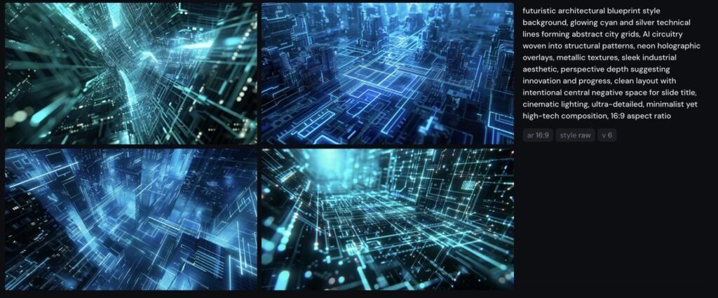
Now comes the fun part: actually generating the backgrounds. I take my prompt from ChatGPT and paste it into Midjourney where I’ll get four generated image variations based on my prompt. Once your prompts start turning into images, that’s where the iteration really begins.
The first batch of images is rarely exactly what I want. Maybe the composition is close but the colors are off. Or the whitespace I asked for isn’t quite centered. Or it’s just a bit too busy and I’m worried text won’t be readable. You’ll notice in this first draft, the colors are a bit off from what I asked for and there’s no empty space for our eventual text. It’s just not an ideal slide background.
This is where I start using Midjourney’s tools to refine:
Subtle variations are my go-to. When I find an image that’s close but not quite there, I can ask Midjourney to generate variations that keep the same general vibe but change small details.
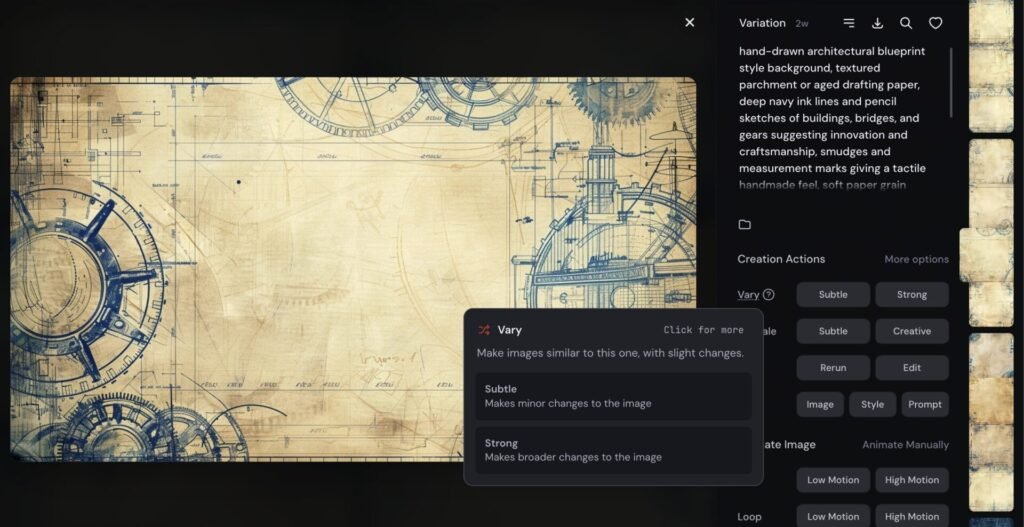
This is perfect for slide backgrounds because I’m usually looking for something that’s a little bit of a different arrangement or something with a bit more space in the middle.
Upscaling is what I do once I find something I like. It takes one of the four generated images and creates a high-resolution version that actually looks good in a presentation.
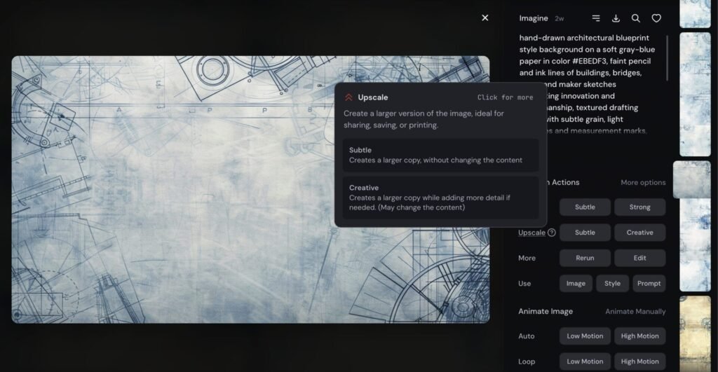
It’s important to note that, at any point in time, I can simply paste a new prompt in the text box up top and get a brand new set of 4 images. Or, if I don’t like the ones I got, I can paste the same prompt and get a brand new set of 4 images. This helps me from getting stuck in the rabbit hole of a type of image that’s not really getting any closer to what I’m looking for.
When I’m evaluating options, I’m looking for a couple things:
Is there enough negative space? I squint just a bit to see where the text on my slides might go. If the busiest parts of the image would compete with my slide titles, it’s not going to work.
Will it get boring after 20 slides? Some backgrounds are visually interesting but would be exhausting to look at for an entire presentation. I try to imagine sitting through my own talk with this background on every slide.
I usually go through 5-10 iterations before I land on something I’m happy with. Sometimes more if I’m being picky. The good news is that each iteration only takes a minute or two, so the whole process moves pretty quickly.
Once I’ve got a winner, I upscale it and download it. Then it’s time to drop it into my presentation tool of choice and add in the other elements of the presentation.
Step 3: Choose a font and text color
It would be a shame to put all this work into our slide background just for the actual text on the slides themselves to be whatever black or white font happens to come with your presentation editor.
So what I’ll do next is take my chosen background back over to ChatGPT and ask for help one more time.
I upload the image and ask something like: “What Google Fonts and color combinations would work well with this background?”
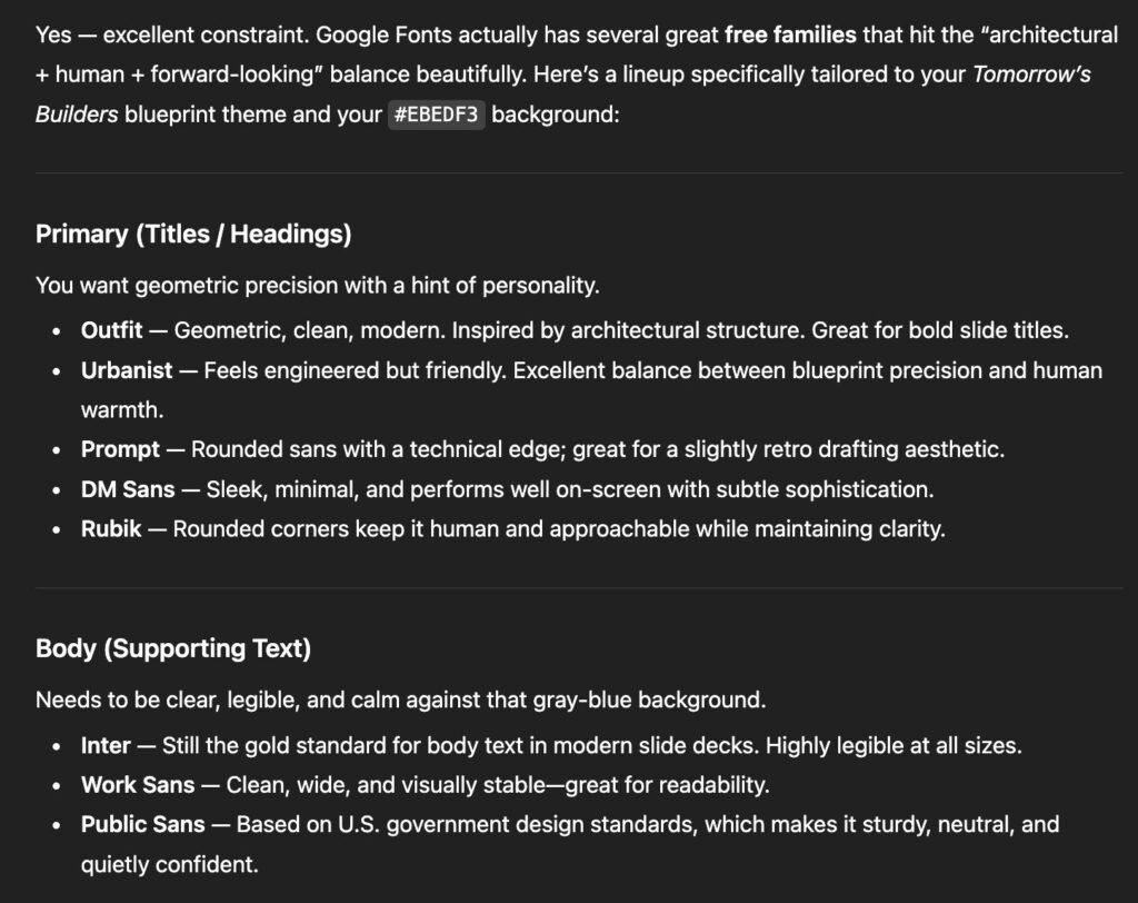
ChatGPT will usually give me 2-3 font options with specific recommendations. For my blueprint background, it suggested things like Outfit or Urbanist. It also gave me specific color codes to use for the text in my presentation. In this case, dark blues and whites that would pop against the blueprint tones without competing with them.
I don’t always use exactly what it suggests. Sometimes I’ll try the fonts and realize they don’t quite feel right. Maybe they’re too bold, or too thin, or just don’t match the energy I want for the talk. That’s ok. The AI gives me a solid starting point, and then I trust my eye.
However, you might also find that it gives you really good suggestions. For example, when I uploaded an example slide and asked it what I could to do make my white text more distinguishable from the background, it suggested adding a drop shadow to the text, which I wouldn’t have considered (again: not a designer over here 😅).
What I’m looking for here (mostly through trial and error in either Google slides or Keynote) is:
- Does the text stand out? I zoom out and take a look. If I can’t read the title immediately, the back of the room I’m presenting in won’t be able to either. That means the color or font weight isn’t working.
- Does it feel cohesive? The font should complement the background, not fight with it. If my background is soft and minimal, a heavy blocky font probably isn’t the move.
I’ll usually try at least a couple combinations before I land on something I’m happy with. Sometimes the first recommendation is perfect. Sometimes I need to tweak the colors or try a different font weight.
Once I’ve got my background and typography sorted, I’m pretty much done. I’ll drop the background into my slides, set up my title slide with the chosen font and colors, and then use those same choices across the rest of the deck for consistency.
The end result


These aren’t going to win any design awards, but it’s a massive step up from a generic template.
The whole process, from initial ChatGPT prompt to final slides, takes me 30 minutes or so, which is a big win compared to spending hours browsing template sites.
I end up with something that feels custom to my specific talk, matches the vibe I’m going for, and looks way more interesting than what I would have come up with on my own.
Want help working AI tools like this into your workflow?
This slide background workflow is really just one example, but once you see how these kinds of tools work, you start noticing these opportunities everywhere in your business. The tricky part is figuring out which processes in your business are good candidates for AI automation, and then actually building workflows that work reliably.
That’s what I do here at Floorboard AI. I help business owners identify opportunities where AI can save time or improve quality, then build custom processes tailored to how you actually work. No generic solutions and no hype. Just practical AI workflows that fit into your existing business.
If you’re curious about where AI might help in your business, reach out and let’s chat.
